Branding
Edible Play co
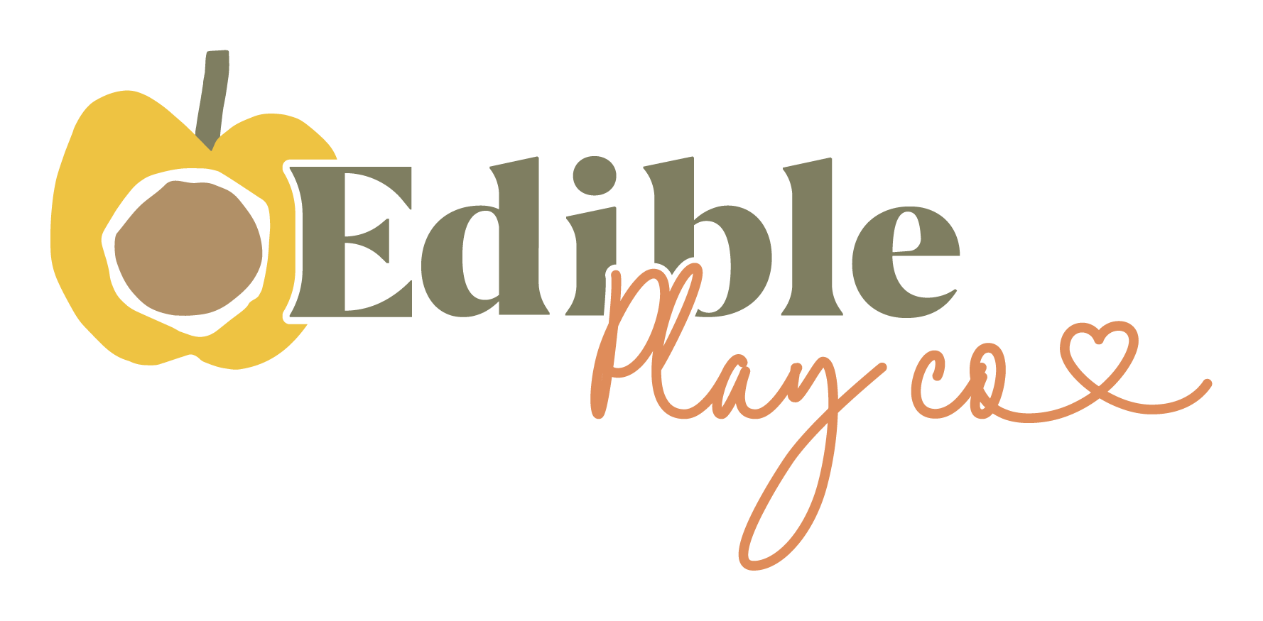
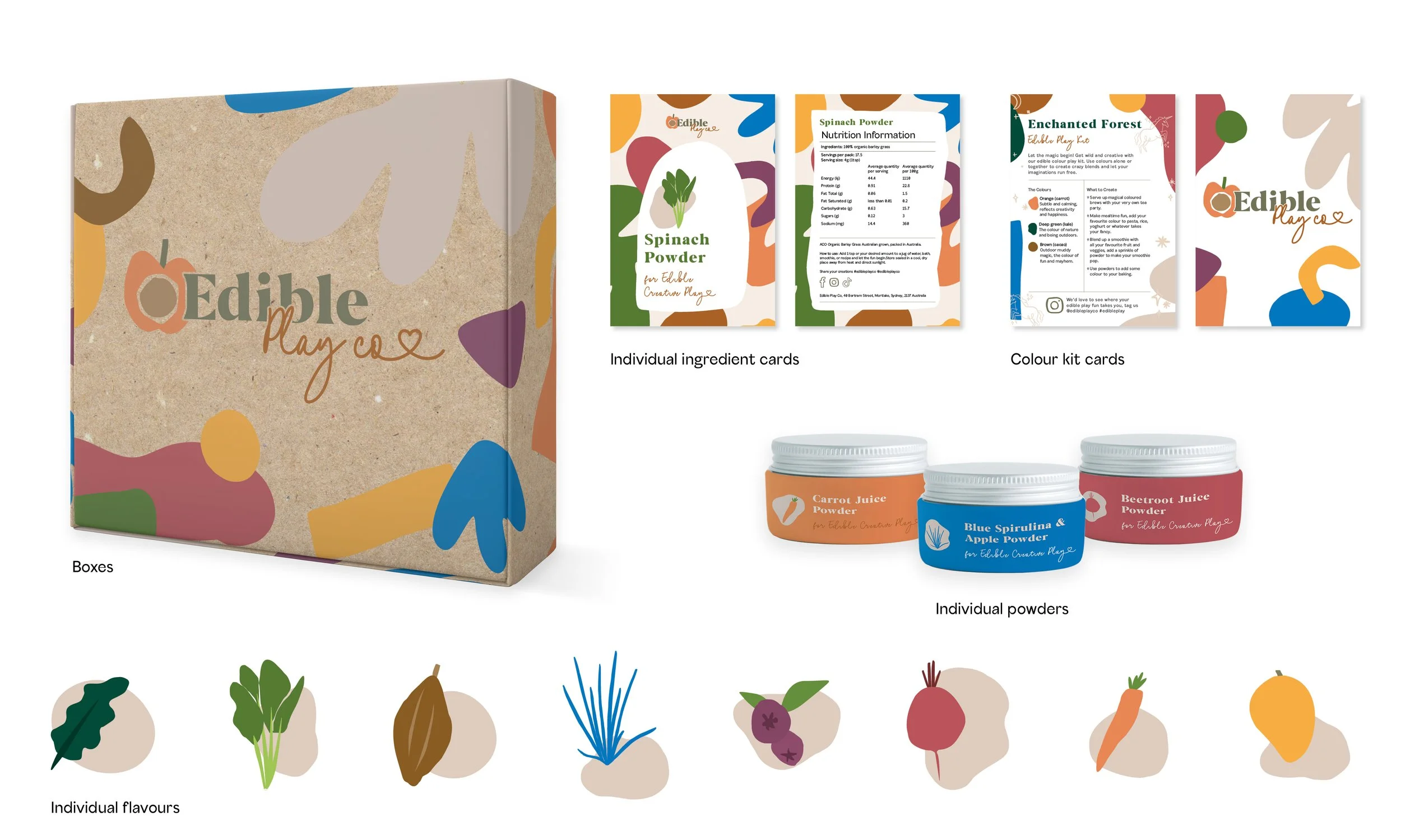
Edible Play co caters to a youthful audience, providing them with edible powders that unleash their creativity by mixing them into various crafts, treats and playtime fun. The logo, the initial focal point, was intricately fashioned, each version aligning with a specific aesthetic that seamlessly extends to all packaging. Following the logo's finalisation, the remaining elements of the brand were developed, encompassing font choices, a harmonious colour palette, distinct flavour identities, and colour kit representations.
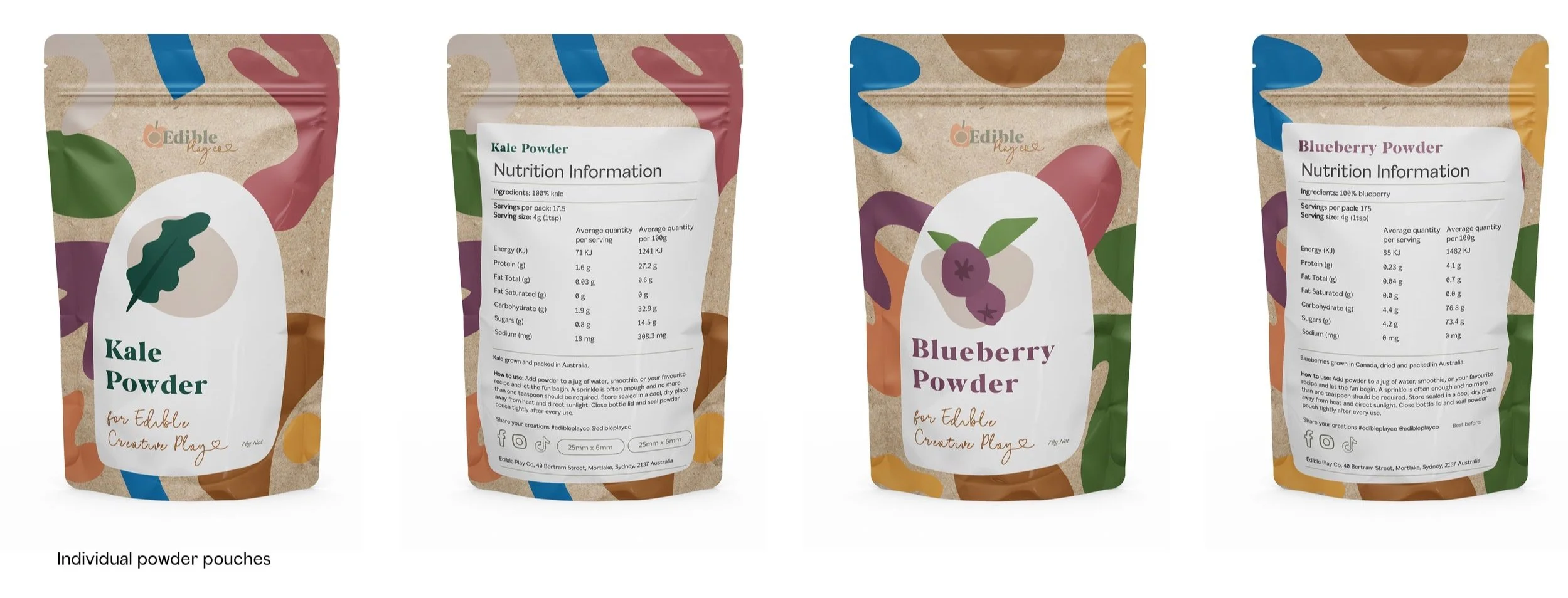
Now armed with these cohesive components, I proceeded to design the packaging for the diverse range of products, as showcased in the pouches, product boxes, smaller color pots, ingredient cards, and color kit cards above.
Poppy Lane
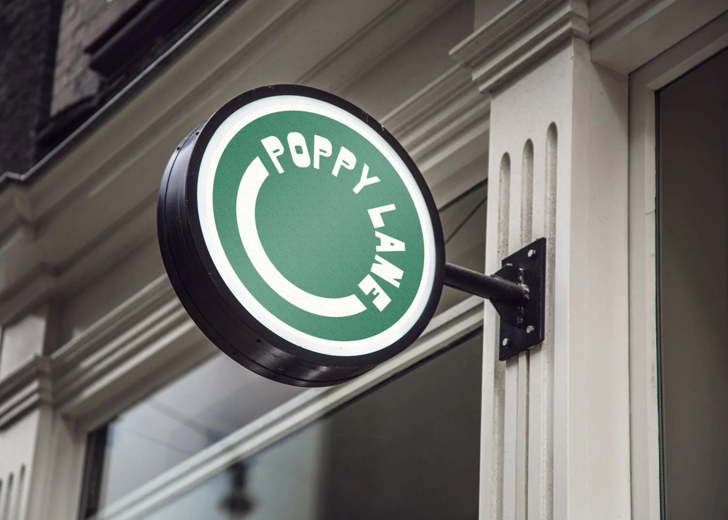
A soon-to-open café in Sydney approached me to create a standout logo that would make a lasting impression in a competitive market. They envisioned a design blending retro and modern elements, with flexibility for future ventures. The result was a comprehensive branding package, including a full-color logo, a reverse version, and a compact logo for uniforms and documents. Additionally, I provided a brand pack to ensure seamless collaboration with other professionals like photographers, videographers, and printers.
Sydney Olympic Park: SQUAD identity
Athletics plays a pivotal role in Sydney Olympic Park, hosting numerous sports teams. This presented an excellent opportunity for the marketing team to collaborate with these athletes through a sports influencer program to be executed on social media.
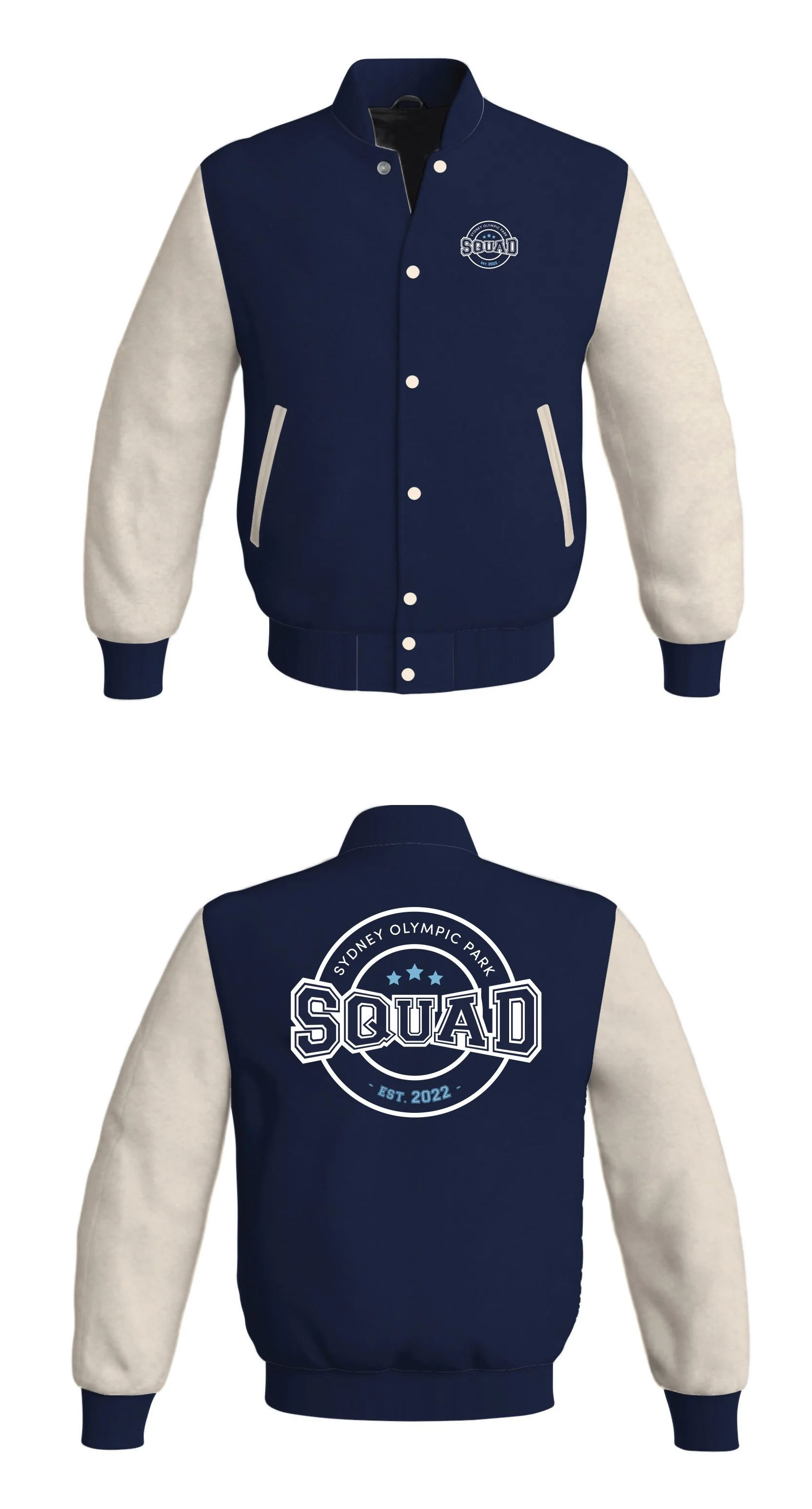
The marketing team approached me with the term 'SQUAD' to serve as a Worldmark identity for this initiative, emphasising a sporty connection to Sydney Olympic Park. The primary focus was to create a versatile logo applicable to merchandise worn by the athletes.
The final logo incorporated the brand's colours and some of its fonts, introducing a new font to infuse a distinct sports-themed identity.
Allworths: Brand redesign
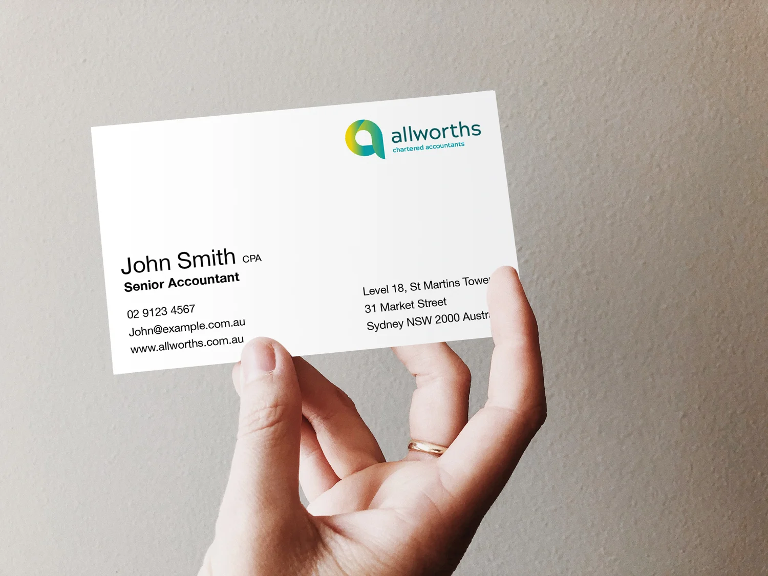
Allworths Chartered Accountants sought to update their existing, outdated logo and branding. Their fundamental principles encompass trust, expertise, proactivity, transparency, and friendliness. The revitalised branding draws inspiration from the imagery of money cascading, floating, zooming, and honing in on essential elements. The design conveys an organic, amicable, soothing, and trustworthy ambiance.
Sydney Olympic Park - Brand development
The existing Sydney Olympic Colour palette was showing limitations that affected the application in marketing collateral and it was clear that trends in the market have moved towards more contemporary hues. The use of the previous colour pairs and sets where quite restrictive, particularly when considering the varied design applications across the brand. Some colours are also less usable or impactful than others and some shades of colour are also a little too dark, not reflecting the vibrancy of the place as effectively as required.
The updated colour palette was inspired directly by natural and built elements in the Park. This gives the colour palette relevance and meaning unique to the Park and its surroundings, reflecting the place perfectly and in turn working cohesively with our suite of photography.
These colours are new and fresh. They add vibrancy and variety to the brand, whilst also staying current with the contemporary trends in the market.
